Email Marketing
Industry Benchmarks
Marketing Metrics
Research
(QSR) Quick Service Restaurants
Email

Introducing the QSR email index: 127 brands, one inbox, sixty days

Corrie's avatar Corrie | Sep 2, 2026
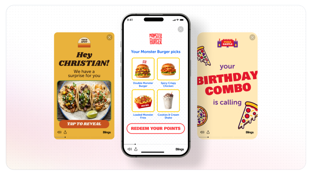
Three phone screens showing a personalized quick service restaurant video, with frames reading Hey Christian and your birthday combo is calling above an order now button.
Corrie's avatar Corrie | Sep 2, 2026

Nobody asked us to do this. That is rather the point.

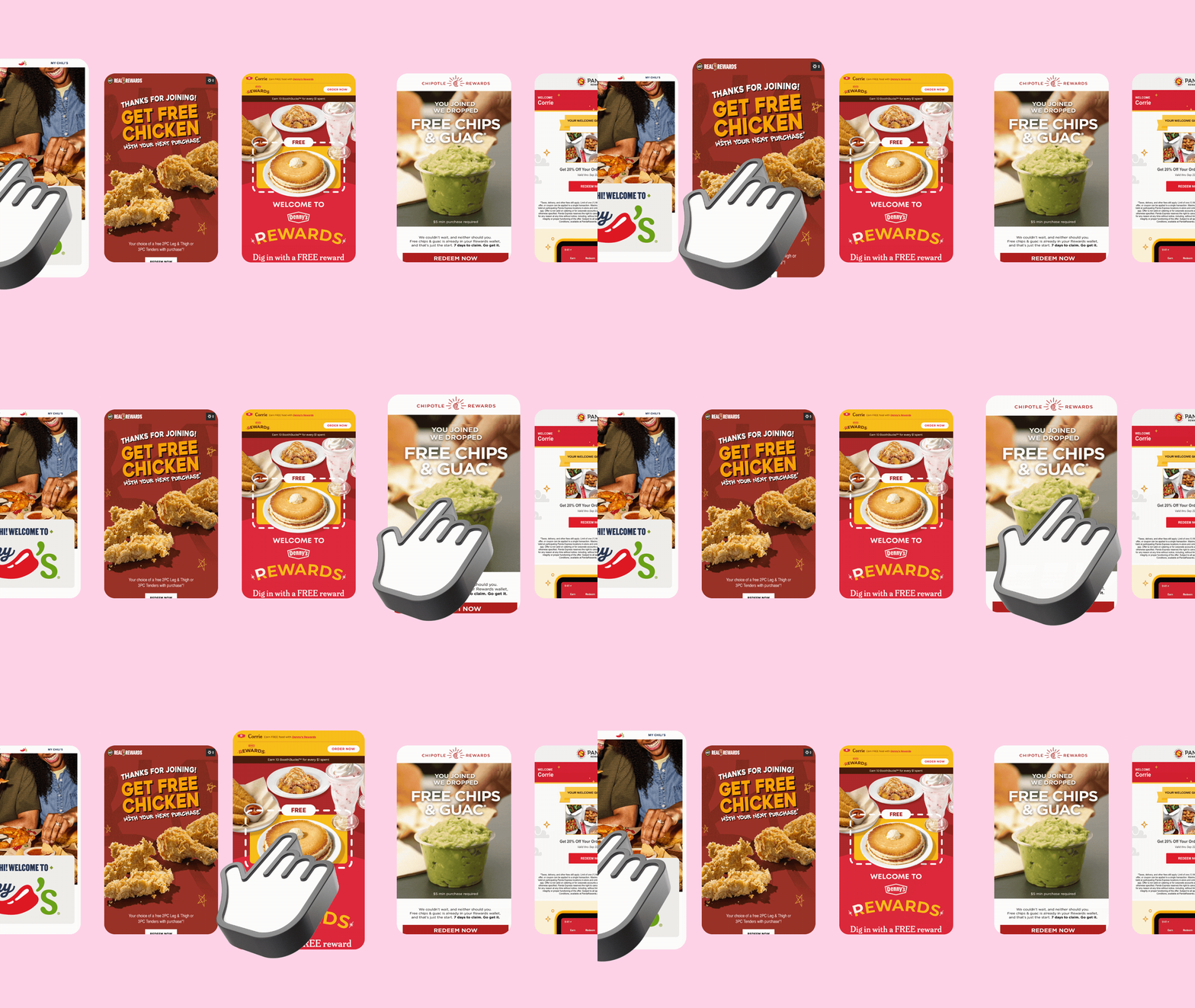
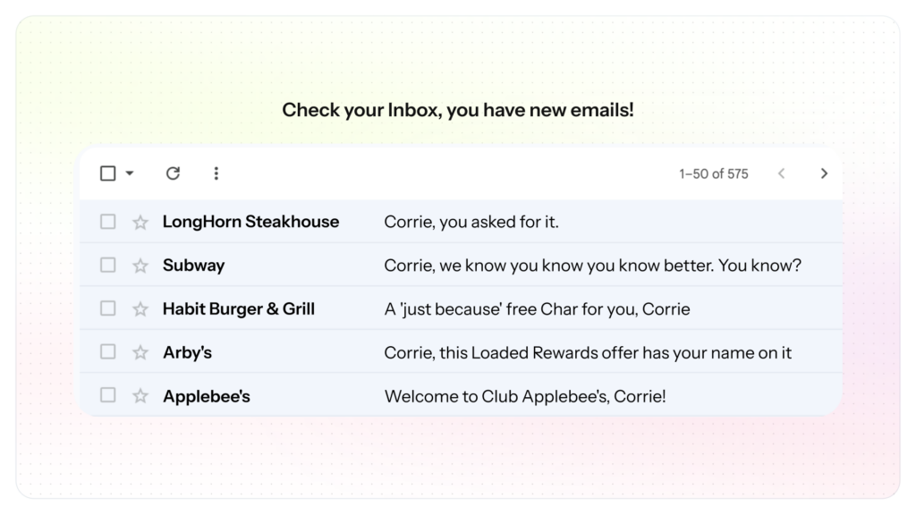
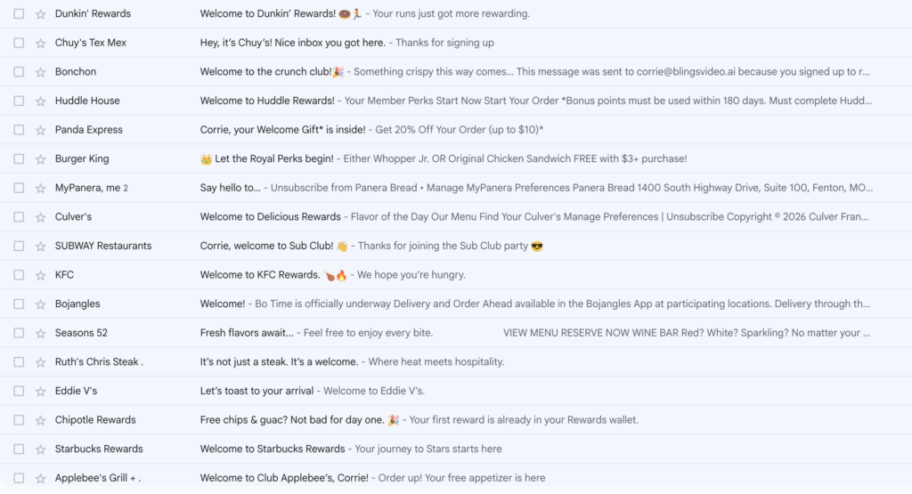
In August 2026 we began enrolling in the email, loyalty, and lifecycle marketing programs of 127 quick service and fast casual restaurant brands. One identity. One inbox. One birthday, one ZIP code, one phone number, and one home restaurant, entered honestly every time. Every message that arrives is captured, labeled, timestamped, and scored against a fixed rubric.

At the close of the sixty day window we will publish a ranked teardown of the category, naming the brands at the top and the brands at the bottom.  We will even award some select brands with special recognition for their unique and impactful work.

This post explains what we are measuring, how we are measuring it, and the rules we have imposed on ourselves before naming anybody.

Want to see how your brand ranks?

Your brand may be one of the 127 in this study. Book a call and we will walk you through its scorecard across all nine dimensions, defects included, before the ranked index publishes in October.

Why this study exists

Every brand in this study can see its own email program. None of them can see the inbox.

A lifecycle team reads open rates, click rates, and redemption on its own sends. What it cannot see is the thing its subscriber actually experiences: eleven brands running the same day-of-week campaign in the same two hours, four brands issuing a coupon nobody follows up on, and a competitor across the street doing the one thing this brand never tried. A dashboard measures a program against its own history. It cannot measure a program against the category.

Putting 127 brands into one mailbox produces findings no brand can learn from its own reporting. That is the entire methodological argument, and twelve days in it has already held up better than we expected.

screenshot 2026 09 02 at 104215 am

There is a second reason, and we would rather state it than have it inferred. Blings works on the gap between what brands know about a customer and what they actually say to them. We suspected that gap was wide. We had no idea how wide, and we had no data. Now we do, and we are publishing all of it, including the parts that make our own assumptions look silly.

What we are measuring

Nine dimensions, scored per brand.

Axis
What it captures
Speed to welcome
Minutes from form submission to first email, bucketed
Barrier to entry
Fields required, account and password, CAPTCHA, double opt-in
Consent quality
How permission was obtained, described, and honored
Data used versus collected
Whether a field the brand asked for ever appears in a message
Offer design
Clarity of the offer, the deadline, and the redemption path
Cadence
Whether each send has its own job
Personalization
Name, location, and behavior, beyond the first message
Output and hygiene
Defects a subscriber can see without opening the source
Preference and exit
What the unsubscribe and preference center actually offer

Ease and consent quality are deliberately separate axes, and this is not a technicality. The easiest programs to join are frequently the ones with the flimsiest permission record. The brands running honest double opt-in score badly on ease precisely because they are being careful. Ranking on ease alone would put the worst consent actors at the top and bury the most rigorous brand in the set.

Definitions

Analyzing. At least one email has arrived in the study mailbox, verification emails included. This is the only stage where scoring is valid.

Subscribed. The form was submitted and nothing has come back. Not a failure, just unconfirmed.

Blocked. A human cannot join, or cannot join without breaking a study constraint.

Not started. Recon complete, enrollment not attempted.

That distinction sounds pedantic. It is not. “Subscribed” was originally doing double duty for “form submitted” and “we know we are on the list,” which quietly inflated the apparent sample size until we caught it and moved fifteen rows back.

Defect. A rendered output error an ordinary subscriber can see. Placeholder text, leaked asset names, stale dates, contradictory deadlines, broken merge fields, and unreachable instructions all qualify. Design taste does not, and we will not be scoring anyone on whether we liked their hero image.

Building trust

A ranked index that names brands only works if brands trust it. The distribution mechanism we are counting on is that a brand scoring well shares it and a brand scoring poorly investigates. Both of those depend on the document being right. A false accusation against a named brand is the single most damaging error this study can make.

Why we care about the answer

The working hypothesis is not that these brands are careless. Most of them are running competent programs under real constraints. The hypothesis is that the distance between the data a brand collects and the content it sends is a structural problem, not an effort problem, and that it is created by how personalized content gets made.

A field costs nothing to collect. Acting on it has historically meant a brief, a designer, a variant, a build, and a deadline. So the field gets captured because capture is cheap, and it never reaches the creative because the creative cannot move that fast.

That is the gap Blings was built to close: create once, personalize forever. A MP5 Smart Video template is built a single time, and every variant is generated on demand at the Moment of Open, from data that never leaves the customer’s own stack.

We think the data will show that gap clearly. If it shows something else, we will publish that instead.

Get more insights

Want updates as this study progresses?

Subscribe now to receive updates as new information is published and get first access to the final report.

Frequently asked questions

What is the QSR email index?

An unsolicited, self-funded benchmark of quick service and fast casual restaurant email programs, measured from the subscriber’s side rather than from platform analytics. It covers 127 brands over a sixty day capture window beginning August 2026.

How were the brands selected?

By category and scale across quick service and fast casual restaurants in the United States, including national chains, strong regional operators, and a small set of adjacent convenience store brands that will be labelled separately.

How is the data collected?

One identity enrolled by hand or by assisted form fill into each brand’s public email, loyalty, or lifecycle program. Every resulting message lands in a single dedicated mailbox where it is labeled, timestamped, and scored.

Are brands being told they are being measured?

Not in advance. The study measures the experience an ordinary subscriber receives, and announcing it beforehand would change the thing being measured.

Can a brand correct a record?

Yes. Every claim in this series is anchored to a verbatim quote, a timestamp, or a directly observed screen, so any brand can check it against its own send logs.

When does the ranked index publish?

At the close of the capture window in October 2026.

How can I include my brand?

Email Blings

This is post one in the QSR email index series. The study runs from August to October 2026.

Your customers are waiting for great video experiences.

Schedule a custom demo